


CKBlog: The Market
Wednesday, July 22, 2020
2020 Semi-Annual Review: A Tale of Two Quarters
by The CastleKeep Team
Had you spent the first six months of 2020 on Elon Musk’s SpaceX trip to Mars, you might return to think 2020 was a “normal” year in financial markets. Below are how major asset classes have performed through June 30th.
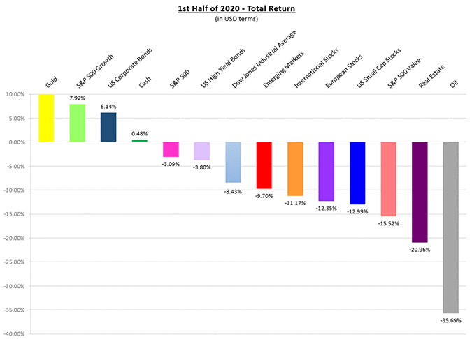
Source: Bloomberg LP.* The broad indexes represented in the graph are as follows: S&P 500 Index, S&P 500 Value Index, S&P 500 Growth Index, Dow Jones Industrial Average Index, US Small Caps: Russell 2000 Index, International Stocks: MSCI World Ex-US Index, European Stocks: MSCI Europe Index, Emerging Markets Stocks: MSCI Emerging Markets Index, Real Estate: FTSE NAREIT Developed Market Index, Gold: SPDR Gold Shares ETF (GLD), Oil: US WTI Crude Cushing Index, US Corporate Bonds: Bloomberg Barclays US Aggregate Total Return Index, US High Yield Bonds: Bloomberg Barclays US High Yield Total Return Index, Cash: Bloomberg Barclays US 1-3 Mo T-Bills. Data in US Dollar terms and as of June 30, 2020.
We all know these returns may seem normal, but the end result tells us nothing about the journey. Take a look at the drawdown and recovery in the S&P 500 Index one-year price chart below:
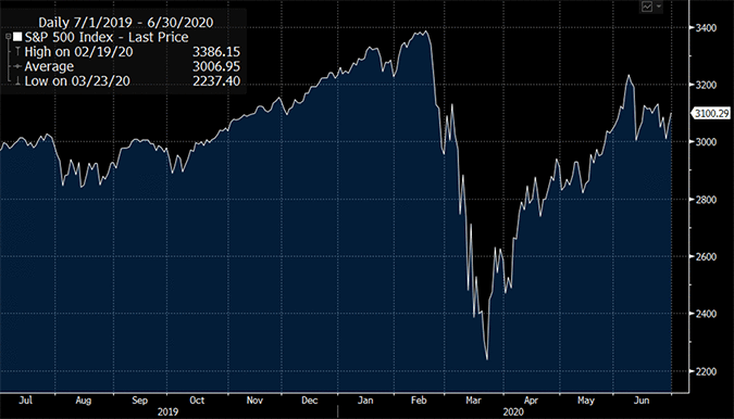
Source: Bloomberg LP
With 50 million Americans filing for unemployment, bankruptcies rising, and a resurgence in COVID-19 cases, how on earth can the S&P 500 Index be trading just off all-time highs? A lot has to do with its make-up.
Go Big or Underperform
One of the persistent themes over the last five+ years has been that the largest companies have performed the best. The global pandemic seemed to have accelerated this paradigm, regardless how expensive these companies trade at using traditional valuation metrics.
Consider the trailing P/E Ratios for the five largest S&P 500 companies to start the year—all were relatively expensive compared to their historical norms:
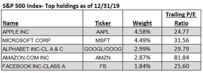
Source: Bloomberg LP
And all got more expensive as their stocks propelled higher.
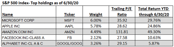
Source: Bloomberg LP
The top five stocks in the S&P 500 now represent more than 20% of the index. They also are considered “growth” stocks by most investors. If you didn’t “go big on growth,” you likely underperformed so far this year. This was well represented by a recent chart from Deutsche Bank published in the Wall Street Journal. It depicts the largest growth stocks by market capitalization versus the rest of the S&P 500.
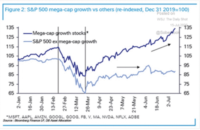
Source: Deutsche Bank Research; The Daily Shot, WSJ.
The non “mega-growth” portion of the S&P 500 is actually down on the year as depicted above. In fact, as of June 30th, 370 companies within the index were down on the year and 177 of those were down by 20% or more. Just looking at the headline result of the index doesn’t give you the full picture.
Sector Bets
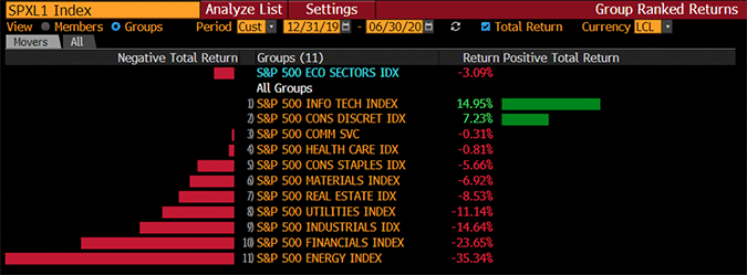
The chart below depicts the performance of each of the S&P 500 Index sectors. Only two sectors experienced positive returns through the first half of 2020: Information Technology and Consumer Discretionary.
Source: Bloomberg LP
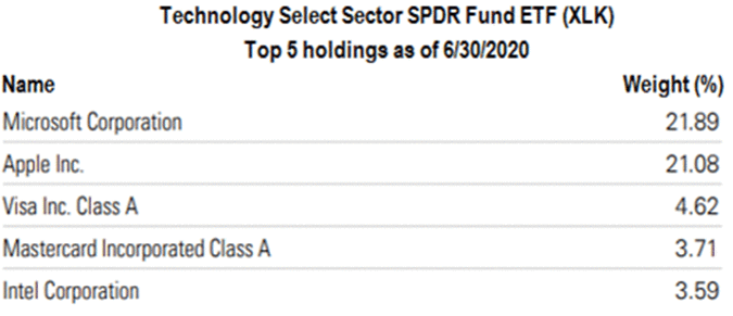
Strength in Technology stocks makes sense to most in a stay-at-home environment. What may come as a surprise, however, are the top constituents in the sector. For purposes of drilling down on the sector constituents, let’s analyze the Technology Select Sector SPDR ETF (ticker XLK) and the Consumer Discretionary Select Sector SPDR ETF (ticker XLY).
Source: SPDR; State Street Global Advisors.
Microsoft and Apple make up over 40% of the ETF. No wonder it has done so well. But Visa and Mastercard are top technology companies? Where’s Amazon?
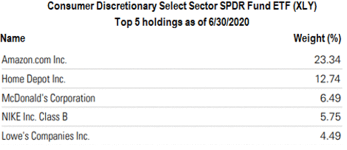
The index providers who compile the sector constituents have decided Amazon is a Consumer Discretionary company. In fact, it represents nearly ¼ of the sector index!
Source: SPDR; State Street Global Advisors.
The charts above should serve as a reminder to look under the hood. The two sectors fared well but are also highly concentrated in the stocks that have done well relative to the others (i.e. market-cap weighted indexes). For example, Amazon represented only 7.11% of the sector index five years ago as of June 30th, 2015. Its weighting in the index has increased more than three times relative to the other constituents. Buying the sector today is making a big bet on Amazon.
Winners Win ... But Forever?
There have been great runs by sports teams and athletes over the years. The Yankees in the 1930s, 1950s, and 1990s, the Celtics in the 1960s, and Tiger Woods for the first two decades of his career. The same is true with the stock market. Themes persist ... then change—sometimes when you least expect it.
Technology stocks have been dominating the market for more than five years. 2020 has been no different thus far. But, as in sports, hot streaks don’t last forever. So when you catch yourself saying, “Technology stocks will always win,” remind yourself the same was said about industrial and oil companies in the past. The chart below takes us down memory lane by listing the largest US companies by market capitalization at the start of each decade since 1960.
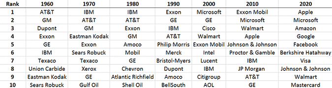
Source: Bloomberg LP; CastleKeep.
Non-US Equities
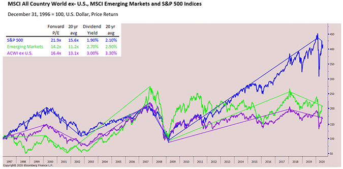
Equity markets outside of the US continue to underperform but they also continue to get cheaper (more attractive). The chart below gives a good representation of this. As the blue line (US) widens its spread, long-term investors are wise to start looking at the green (Emerging Markets Equities) and purple (Non-US Equities) lines.
Dig deeper (upper left box on the chart) and we see that using Forward P/E Ratios as a valuation metric, Non-US and Emerging Markets equities are roughly 25% to 35% cheaper than US equities respectively. Want to get paid while waiting for them to recover? Non-US and Emerging Markets equities both sport dividend yields that are more than 30% higher than their US counterparts.
Emerging Interest in Emerging Markets
Over the last three years, the Emerging Markets (EM) have underperformed the S&P 500 by roughly 10% per year on an annualized basis. Before the pandemic hit, we were actively analyzing various managers in that space because we felt that EM in general were undervalued. As COVID-19 spread and out of an abundance of caution, we put a temporary hold on direct investments in EM, awaiting a better understanding of how the major countries react to the pandemic. It is increasingly difficult to analyze the asset class as a whole because of the continued inclusion of China (and its lax accounting standards) within most EM indexes. If our objective is to limit Chinese exposure, we can be selective using country-specific strategies or employ an active manager with direct expertise in Asia and EM.
Emerging countries outside of Asia are suffering, in general, because the lack of adequate health care systems and the existence of large-scale lower income segments in the population. When economies are growing and more people move from lower to middle class, EM economies and their equities become more attractive. The opposite is true when EM countries are under duress (such as today). We still believe EM equities have merit in general with specific countries poised for outsized returns—a trend that seems to have started to since June 30th (largely due to China’s rebound last quarter).
At some point, global investors will recognize the opportunities abroad. We continue to find non-US stocks attractive and may initiate direct EM exposure in the near term.
Froth
There is some evidence of froth in certain sectors of the market, highlighted by “stay at home stocks” like Zoom (up over +250% on the year through June 30th) and cult stocks like Tesla (up four-fold from its March lows as of this writing). The story around Tesla has been remarkable. Robinhood, a popular trading app among millennials, reported that in just four hours on July 13th the number of Tesla stock owners jumped by 50,000 on the app.
There’s froth in individual stocks but it also exists in the major indexes. The NASDAQ Composite Index, which most regard as a technology index, was up +12.74% in the first 6 months of 2020. It is now trading at a relative high versus the S&P 500 not seen since the Dotcom bubble. Will it last?
The chart below depicts the price of the NASDAQ Composite Index divided by the price of the S&P 500 Index. A rising line means the NASDAQ is getting more expensive relative the S&P 500.
NASDAQ (CCMP)/S&P 500 Index (SPX) from 6/30/1995 to 6/30/2020
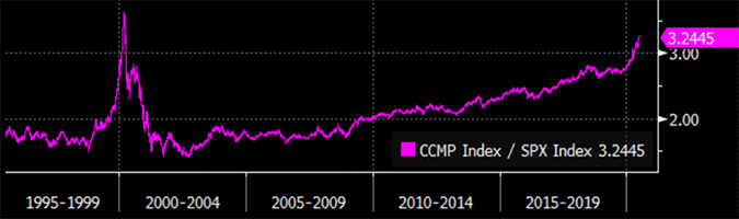
Source: Bloomberg LP
It’s even more stark when you compare the NASDAQ to the S&P 500 Value Index. We are in unprecedented territory.
NASDAQ (CCMP)/S&P 500 Value Index (SVX) from 6/30/1995 to 6/30/2020
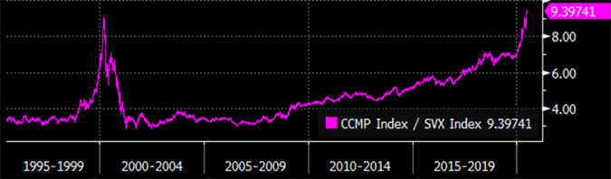
Source: Bloomberg LP
Rates
Interest rates have never been this low in the US (the same is true for most of the world). As we type this, the yield on the US 10-Year Treasury Note is 0.63%. As a result, the average rate on 30-year fixed loans just hit an all-time low (currently at 2.93%). No surprise, housing has been strong despite the shutdown.
Low interest rates (with the expectation they will be higher in the future) make cash and bonds less attractive today (but still useful in portfolio construction). This drives more people to stocks as 77% of the companies in the S&P 500 Index currently have dividend yields higher than the US 10-Year Treasury.
What’s Next?
Investors will continue to react to COVID-19 case and death counts, openings, closings, and headlines about vaccines. It is not useful to try and predict upcoming headlines related to COVID-19 nor is it possible to predict how the markets will react to such headlines—recall the S&P 500, the Dow Jones, and NASDAQ were all up more than 5% on the day of March 26th when the US announced a then record 3,280,000 people lost their jobs the week prior.
Economists are predicting the worst contraction is US economic history. They are also predicting the best recovery. Same is true regarding Wall Street analysts’ predictions about company earnings. So, hang on.
It’s worth paying attention to the price of gold, which is now trading at its highest level since 2011-2012. Are investors buying the precious metal as a store of value during volatile times or as a hedge against inflation? Recall that we were in a similar environment in 2011; the world was coming out of a painful recession and governments around the world were printing money at unprecedented levels.
Nobody knows when COVID-19 will be behind us. But when it is, there will be trillions more money sloshing around the system. Inflation is likely (finally).
Presidential Election
There will be much chatter on the November US election for President and seats in the House and Senate.
We do not pretend to foresee whether President Trump will prevail or whether the makeup of Congress will materially change, but we do know two things. First, headlines about both will move markets in the short-term. Second, (politics aside) market participants should cheer for a divided government. The below, from Goldman Sachs uses history and statistics to demonstrate returns during divided and unified governments.
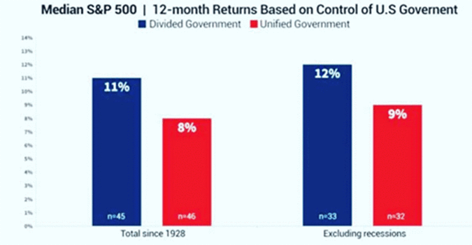
Source: Goldman Sachs Global Investment Research.
Hold On
Broken record aside, we’d like to end the analytic portion of this review by reminding you that it pays to hold on. So, thank you for doing just that, especially during the most volatile and perhaps scariest six months some of us can remember.
Your investment journey can be painful in the short-term (as it has been this year), but whether you hold bonds, stocks, or a 50-50 mix, your results get better the longer you hold. The chart below from JP Morgan is proof.

You can’t win the game if you quit halfway through.
COVID and CastleKeep
Steve here. On April 27th, I was diagnosed with COVID-19. Four days of headaches, body aches, fever, lethargy, disorientation, and extreme shortness of breath followed. Isolation was difficult but required. On May 2nd, I was symptom free and have felt 100% since then. Thankfully, my wife and son were never infected. Nor were the few folks I had come in contact within the days leading up to diagnosis (I notified each of them when my test came back).
The virus is serious—even for a reasonably healthy 38-year-old. So please remain vigilant and protect yourself and those closest to you.
While we never anticipated a global pandemic, CastleKeep prepared for a scenario where we’d have to work off-site (and had a dry run in 2019 while our office was being renovated). Other than an occasional cameo by a child or pet, we’ve been pleased with our technology and processes while working from different locations for much of this year.
As always, we appreciate the trust and confidence you have placed in us. Now more than ever.
Sincerely,
The CastleKeep Team
July 22, 2020
Here is the PDF version of our 2020 Semi Annual Review: A Tale of Two Quarters