


CKBlog: The Market
Tuesday, January 28, 2020
2019 Market Review
by The CastleKeep Team
Everything worked in 2019.
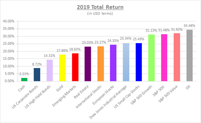
Source: Bloomberg LP.* The broad indexes represented in the graph are as follows: S&P 500 Index, S&P 500 Value Index, S&P 500 Growth Index, Dow Jones Industrial Average Index, US Small Caps: Russell 2000 Index, International Stocks: MSCI World Ex-US Index, European Stocks: MSCI Europe Index, Emerging Markets Stocks: MSCI Emerging Markets Index, Real Estate: FTSE NAREIT Developed Market Index, Gold: SPDR Gold Shares ETF (GLD), Oil: US WTI Crude Cushing Index, US Corporate Bonds: Bloomberg Barclays US Aggregate Total Return Index, US High Yield Bonds: Bloomberg Barclays US High Yield Total Return Index, Cash: Bloomberg Barclays US 1-3 Mo T-Bills. Data in US Dollar terms and as of December 31, 2019.
All of this despite:
- “Trade War” with China.
- Yield curve inversion. (CastleKeep Blog: Don’t let the inverted yield curve invert your investment plan)
- Continued recession fears.
- WeWork pulling their IPO and 80% valuation write-down (within days).
- House impeachment of President Trump.
- Tensions in the Middle East.
However, this is nothing new. Over the last ten years, sensational headlines have temporarily stalled this bull market, but it will likely take more (i.e. recession) to stop it entirely. The Iranian bombing of a US Base in Iraq earlier this month was yet another example. US equity markets closed higher the next day and the positive trend has continued.
So What is Going On?
- Global interest rates are low (still). We are oversimplifying here, but with cash and bonds yielding so little, investors are incentivized to look elsewhere. Heck, the indicated dividend yield of the S&P 500 Index (roughly 2%) pays more than the US Government 10-year bond today. Even Apple stock yields roughly 1%. What does your savings account pay?
- The US economy is strong and despite the headlines, the rest of the world is doing reasonably well too. The IMF expects global GDP to grow by 3.3% in 2020, up from 2.9% in 2019.
- Consumer Confidence index is high. This monthly measure details consumer attitudes and buying intentions. When it is high, people feel good and tend to buy things. Buying things is good for the economy and business in general. Remember that consumer spending is roughly 70% of the US economy.
- The unemployment rate was 3.5% in December—the lowest in 50 years. Wages were up by +3.7% in November, and are trending toward their 50-year average of 4%. Americans tend to spend their pay increases.
- Corporate profits are near all-time highs and are expected to continue their trend higher. The graph below displays quarterly operating earnings for the S&P 500 stocks over the last 20 years:
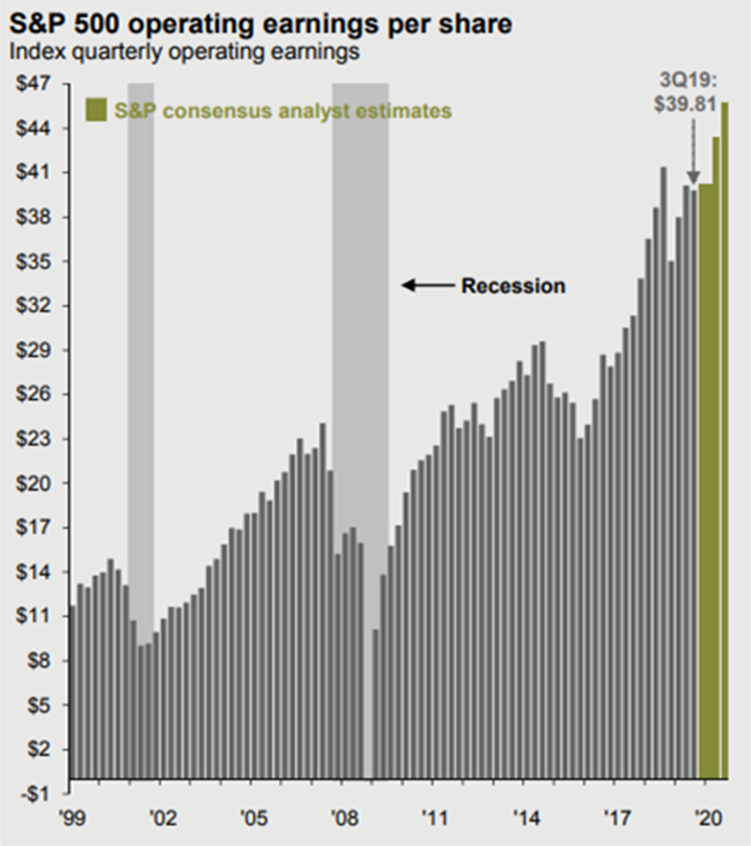
Source: J.P. Morgan Asset Management
We caution, however, that nothing lasts forever. So just because things are great today, and have been for years, we advise against going “all in” on stocks, especially the high-priced ones often mentioned by pundits.
Value Beat Growth. Is WeWork to Blame?
US value stocks outpaced growth stocks in 2019 (albeit by less than 1%). But growth stocks remain expensive relative to value stocks. The table below depicts the current average Price-to-Earnings (P/E) ratios.
For example in the first row, large cap value stocks are priced at 15.2 times their earnings versus large cap growth stocks, which are priced at 23.1 times their earnings.

Source: FactSet; Data as of December 31, 2019.
Historically, it is prudent to buy things when they are cheap and sell them when they, well, reach WeWork IPO status….
WeWork famously pulled its IPO in September and its valuation (private) went from $47 billion to $5 billion in a matter of days. Many point to this event changing the investment sentiment away from growth and more towards value. Keep in mind that WeWork wasn’t the only money-loser to suffer in 2019. Uber and Lyft both had IPOs in 2019 and finished the year down -33.91% and -40.25% respectively, from their IPO price.
What do all these companies have in common? They burn through cash at alarming rates. Perhaps the market reaction to these IPOs reminded investors that cash flow positive companies fare better than those that spend all of their cash (and then some).
The Biggest Getting Bigger
One trend that has been in place for the last five years or so is the largest companies within the S&P 500 Index are driving the bulk of the index’s return. The following chart from The Daily Shot demonstrates this well.
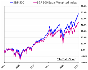 The blue line is a market cap weighted index (the one most investors use) where each company is weighted by their market cap (size). The larger the market cap, the larger the weighting in the portfolio and vice versa. For instance, Apple, being the largest publicly traded company in the US, has the largest weighting of roughly 5% in the S&P 500 Index.
The pink line is an equal weighted index where every company has an equal weight within the index (100/500= 0.2% weighting for each stock) regardless of size.
The blue line outpacing the pink line demonstrates that the largest companies (think Apple, Microsoft, Amazon, Facebook, and Berkshire Hathaway) have been faring better than the smaller companies in the index.
Cash at Private Equity Firms Hits All-time High
According to recent data, the private equity industry now has $1.5 trillion (with a T) in unspent capital.
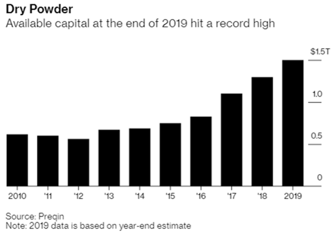
This will likely drive up prices of private companies as private equity firms grow eager to put this cash to work. After all, they generally don’t begin earning fees until that cash is invested. Paying higher prices now means it will be harder for these firms to generate higher returns later. Or is the new paradigm “buy high and try to sell higher?”
Buffett was Idle in 2019
Meanwhile, Warren Buffett remained patient. We recently learned Buffett offered roughly $5 billion to purchase a company called Tech Data but declined to enter a bidding war against private equity titan Apollo Global Management when he was outbid. He also declined to make an offer on luxury jeweler, Tiffany & Co., after investment bankers looking to make a deal approached him. As of its last quarterly reporting, Berkshire Hathaway held more than $125 billion in cash.
Being fearful when others are greedy is classic Buffett yet investors haven’t been thrilled with his apparent inaction. Shares of Berkshire Hathaway trailed the S&P 500 Index by over 20% in 2019. A rare occurrence as Berkshire stock has more than doubled the annual return of the S&P 500 Index (with dividends) from 1964 through the end of 2018—a more than decent track-record. Has something changed?
We don’t think so. True, Mr. Buffett has not made a major acquisition for some time but the underlying companies within Berkshire’s portfolio have been printing money. How do you think the holding company accumulated that $125 billion in cash? In the 3rd quarter of 2019 alone, its cash balance grew by $23 billion. Generating over $20 billion of free cash flow in 90 days while “sitting idle?” That’s idol status in our book.
2020 Vision
As we look forward to this new decade, we will be paying close attention to the following themes:
1. US Presidential Election
The US will vote for President in November 2020. Pundits tell you Bernie Sanders and Elizabeth Warren are “bad” for stocks, Joe Biden is “okay,” and a President Trump re-election will be “good” for the stock market. We remind you, however, that President Obama was supposed to be “bad” for stocks and leading up to the 2016 election, pundits also prophesied that stocks would fall should Trump be elected (our recency bias makes us forget this). They were wrong in both cases.
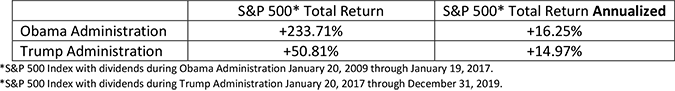
Below is a chart of S&P 500 Index performance (excluding dividends) under each president’s administration:
Source: Fortune/S&P Global.
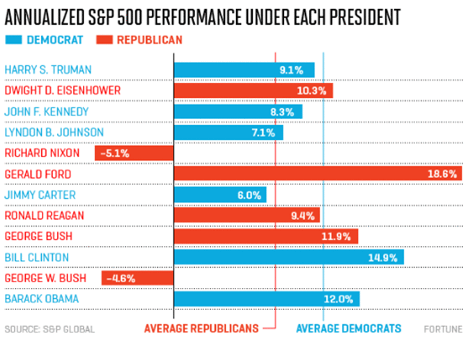
More interesting to us are the seats in the House of Representative (435) and Senate (35) up for vote this year. It appears that Senators Warren and Sanders aren’t pro-business, but It won’t matter if the Republicans control Congress. Similarly, a Trump re-election should mean his pro-business agenda remains intact, but not if the Democrats control Congress. So what should investors hope for come November?
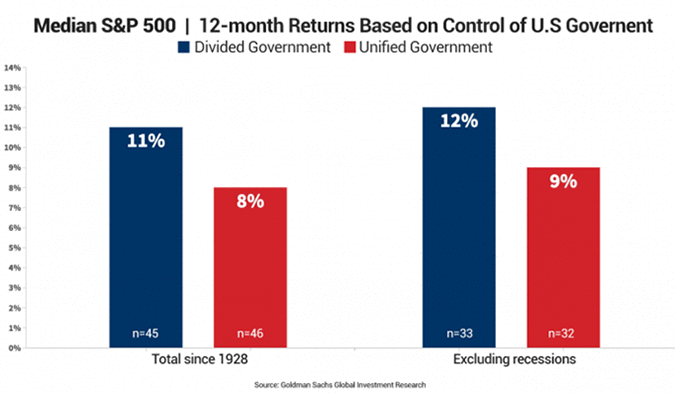
History tells us a divided government (status quo) is best for stocks. Check out the next graph:
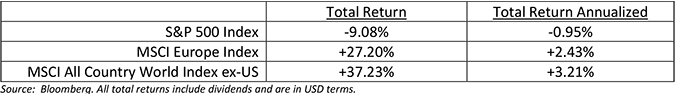
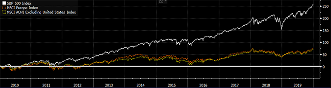
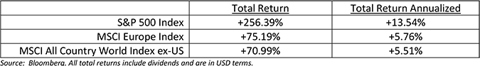
2. US Equities (S&P 500 Index) versus Non-US Equities (MSCI Europe Index and MSCI All Country World Ex-US Index)
Non-US stocks dominated the first decade of the millennium (December 31, 1999 through December 31, 2009):
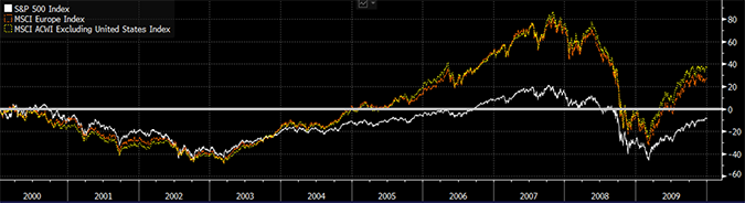
Interestingly enough, the opposite occurred in the second decade. US stocks absolutely crushed World and European stocks.
Non-US stocks remain far cheaper than their US counterparts by most measures. The following graph is one of our favorites. Blue represents the US, green represents emerging markets, and purple represents global non-US stocks. It was great to own the US for the last ten years, but for the next 10? Fight the urge to think linearly!
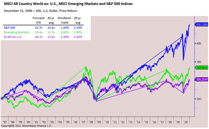
Source: Bloomberg.
3. US Housing Starts
The US still faces a shortage of single-family homes. Housing starts (the construction of privately owned homes) peaked in 2006, artificially supported by the housing bubble. During and immediately following the crisis, construction dried up but has been recovering, albeit slowly, ever since. Look for the below trend to continue, which will further support the US economy. The construction of single and multi-family homes represents roughly 3-5% of US GDP each year according to the US Bureau of Economic Analysis.
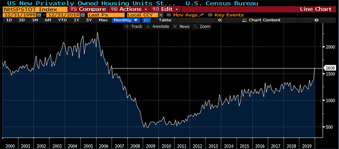
Source: Bloomberg.
Builders are trying to keep up with demand. 2018 household formation was appreciably higher than years past (2019 numbers out shortly). Do we have millennials to thank?
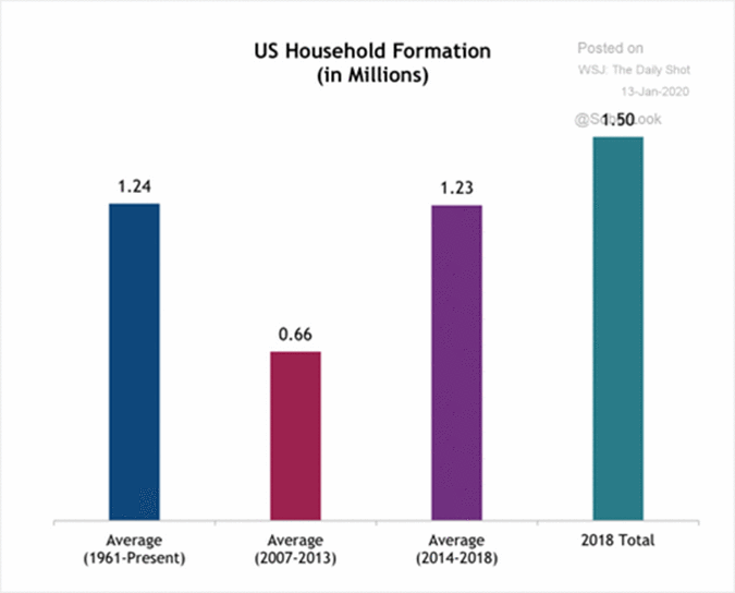
Source: The Daily Shot.
4. Search for Yield
We’ve had more clients ask about high yielding investments this year. It’s not surprising given paltry levels of global interest rates. Will the hunt for yield continue? Will this bid up the price of income producing assets in turn lowering their future expected returns?
Check out the yields on various asset classes below:
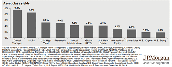
The chart above doesn’t factor inflation, something we are paying close attention to. The US Consumer Price Index (CPI) has averaged 1.8% annually over the last 10 years. Should inflation pick up appreciably, expect the Federal Reserve to raise rates—something the stock market hated in late 2018.
Rising inflation is also bearish for bonds as future coupons will be higher than the ones your current bonds pay. So if you expect rates to increase substantially (and rapidly), we wouldn’t recommend hiding out in bonds. Hard assets such as commodities and real estate tend to do better than stocks and bonds during periods of high inflation.
5. All-Time Highs, Fund Flows, and Trend Lines
Lastly, we are often asked, “Can the market continue higher? Why would I invest at all-time highs?” We wish that we had the ability to successfully time the market in the long-run but we don’t (no one does). So it would be foolish for us to tell you to wait for some specific event or date on the calendar to “get in” when prices are lower. It’s true, the US stock market (along with many other markets around the world) are trading at all-time highs. Should we be surprised given the market trend over the last 10, 20, 50, and 100 years has been higher?
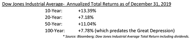
Source: Bloomberg; Dow Jones Industrial Average Total Return including dividends.
If you are sitting on a pile of cash and anxious about putting funds to work, you are not alone. There continues to be a record amount of “cash” on the sidelines. According to the Investment Company Institute, total money market fund assets stood at an all-time high of $3.64 trillion to end the year (up from $3.0 trillion in 2018).
Investors are also hiding in bonds. The graph below illustrates how more money is flowing into bonds than stocks, a trend that has been in place for more than 10 years ...
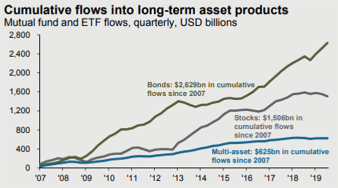
Source: J.P. Morgan Asset Management; Guide to Markets 2020.
At the end of the day, all markets are driven by supply and demand. Stock prices can only continue higher to the extent that people have funds available to buy more stock.
Anecdotally, most people we speak with expect the market to cool off. Others have more dire predictions. Counter to what most people might think, this is bullish for stocks. We’d be concerned if the majority of folks said buying stocks today is a “no-brainer”—something we haven’t experienced in earnest since the Tech Bubble. It is usually wise (in the long-run) to fade the “no-brainers” and buy quality assets most people shun. Two collective “no-brainers” come to mind: real estate in 2006-2007 and Bitcoin in 2017 ...
Perspective
Finally, for some perspective. With stocks being up by 20% to 30% in 2019, the knee-jerk reaction is to say, “It’s gone up too much, this is crazy!” Recall, however, that the stock market had a major sell-off in the fourth quarter a year ago sending US stocks 20% lower by Christmas Eve in 2018. Much of 2019’s gain was a recovery from the sell-off.
Measuring stocks strictly on an annual basis can be random and can lead to misguided conclusions. In a vacuum, 2019 seems like an anomaly, but it wasn’t. The long-term trend since the bottom of the market in 2009 (which is represented by the white line in the chart below), is still intact.
We are paying close attention to the slope of the red line. Markets recently have risen faster than the longer-term post-crisis trend. If the steepness of the red line continues, we would be concerned about investors turning euphoric.
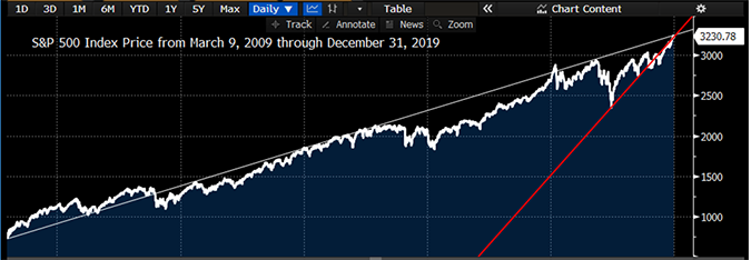
Source: Bloomberg.
As famed investor John Templeton once said, “Bull markets are born in pessimism, grown on skepticism, mature on optimism, and die on euphoria.” We’d argue we recently transitioned to the “optimism” phase. If investors get too excited about stocks, we might look to trim our clients’ stock exposure—but we aren’t there yet.
Thank You, Nancy!
On a personal note: In 2019 our long-time Office Manager, Nancy Perrin, retired after working with us for 13 years. Nancy was far more than an Office Manager—the title doesn’t do her justice. While she was an integral behind-the-scenes player for CastleKeep and its clients, her caring and friendly demeanor was a warm welcome to all visitors at the office. There was never a project she couldn’t tackle with speed and precision. CastleKeep would not be where it is today without Nancy’s contribution. We miss her, but wish her and her husband, Marshall, wonderful retirement years filled with travel and many grandchildren. They deserve it!
Social Media
Efficient communication with clients is paramount to us. To that end, we have been doing more with our CastleKeep blog, Twitter account, and our just-launched Instagram account.
Thank you for your support.
Best wishes for a prosperous and healthy 2020!